
People love a vintage car. A classic Mustang, a cherry Corvette. So why don’t they just keep the same body style and make them year after year? Because the only thing people like more than a classic is something brand new.
Same goes for books. If a book is lucky enough to be reprinted—either in softcover or with a new publisher—the look of the book always changes. It’s an interesting practice—to take something people know and liked (enough to put a book into a second edition) and then change it. If a book goes on being published for decades, a novel can end up with a dozen different looks through the years.
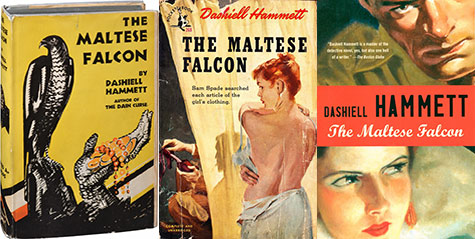
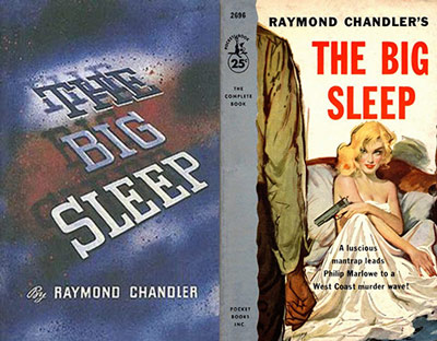
First editions are the collector’s items. For classics like The Big Sleep or Murder on the Orient Express, those firsts go for big bucks. One way to keep them special is to limit the cover art to only that edition. Going from hardcover to paperback? Time for a redesign.
Classics take time to evolve. A few months down the road from first publication, who can tell if a book will be around fifty years later? Might as well update the look.
Quite often, there is a different market for paperbacks off a spinner rack than for more expensive hardcovers; hence the more lurid looks of dime novels as seen in the tame cover for The Big Sleep versus the more straight-ahead pulp style of the paperback.
In some cases, times change. And with the time, so does fashion, design style, font choice, etc. A veteran like Nancy Drew showed up on the scene with a distinct look of youthful vibrancy. For her day.

In the edition of Nancy’s debut novel, The Secret of the Old Clock, that I remember from my sister’s shelf in the late ‘70s, Nancy no longer looked like a girl out of the 1930s. The readers changed style, and Nancy changed right along with them.

A veteran like Agatha Christie, still a champion in all-time sales records, gets a new look every few years. This year, she got an updated look to tie into a new movie release, something that had happened years before with the first adaptation.

A publisher certainly couldn’t try to sell a novel covered in the wrong film cast. Updates are needed.
Then, sometimes an author becomes the draw to a book. If you look at the first edition of Sue Grafton’s debut, A is for Alibi, you’d have a hard time even finding her name.

But more recent editions push her name to the top and in a larger font than the title of the book.

Then, of course, what works in one country might not work worldwide. More than simply the language of the title changes when a book goes overseas. Aesthetics are different in different cultures, design styles vary. A global success can end up with a dozen different looks and even different titles, such as our friend Nancy Drew’s debut in Norway, which was simplified to Miss Detective.

My most recent book has a new look. The trilogy has been through three different publishers (long story), which required three different looks as the first book in the trilogy, The Devil Doesn’t Want Me, went in and out of print.
Honestly, I was never a huge fan of the first look. It didn’t indicate the pulpiness inside.

For the second look with the second publisher, I felt we were getting closer.

But when the second in the series came out, the publisher kept with a theme that ended up being confusing for readers. Side by side on a table, the two books looked too similar, and there was no indication which came first.

When it came time to redesign the entire trilogy for the latest (and fingers-crossed, final) release, I took on the task myself. The publisher wanted a more up-to-date look, something eye-catching but not too overtly violent or pulpy since the books have a lot of heart to go along with the blood and action. I went with a theme of the locations in which each book takes place combined with some typography that grabs the attention. Hopefully, I succeeded.
Read Scott Adlerberg's review of The Devil at Your Door!

The real test will come when main characters Lars and Shaine are as old as Nancy Drew. Will they have been through as many cover changes? Will they share the same stylistic variations as Raymond Chandler?

Only time will tell. But hang on to those first editions. They might be worth something someday.
Read an excerpt from The Devil at Your Door!
To learn more or order a copy, visit:
![]()

![]()
Eric Beetner has been described as “the James Brown of crime fiction—the hardest working man in noir.” (Crime Fiction Lover) and “The 21st Century’s answer to Jim Thompson” (LitReactor) He has written more than 20 novels including Rumrunners, Leadfoot, The Year I Died 7 Times and Criminal Economics. His award-winning short stories have appeared in over three dozen anthologies. He co-hosts the podcast Writer Types and the Noir at the Bar reading series in Los Angeles where he lives and works as a television editor.
fonts are an important part of any design project. They can convey a particular message or set the tone of a piece. However, finding the right font can be a challenge, especially if you’re working with a limited budget. Fortunately, there are a number of ways to get free fonts. One option is to use a search engine such as Google Fonts or Adobe Fonts. These sites offer a wide selection of fonts that you can download and use for personal or commercial projects. Another option is to visit font websites such as DaFont or 1001 Free Fonts. These sites offer thousands of free fonts that you can browse through and download. With so many options available, there’s no excuse not to take advantage of these free resources.