![]() When J. Kingston Pierce of The Rap Sheet brought back the crime cover contest this year, we were delighted—so here's more from him, including a chance to share with you!
When J. Kingston Pierce of The Rap Sheet brought back the crime cover contest this year, we were delighted—so here's more from him, including a chance to share with you!
I come from a very visually oriented family—my father was an architect, my mother had worked in the field of technical drawing. And I remember well the first time I realized that book-cover design meant something special to me. It was in the early 1970s, when I was still a boy. I had purchased (for the then princely sum of 75 cents) a 1969 Ballantine paperback edition of Arthur C. Clarke’s 1953 alien invasion novel, Childhood’s End. Subsequently, the same publisher released a revamped edition of that book (this time priced at $1.25!), which featured what I decided was a more captivating cover illustration. I promptly started saving coins enough to buy that new version, in addition, despite my mother’s protestations that it was not worth the price, that—save for the cover—they were the exact same book. I was less than eloquent in explaining why I needed both versions, but I did finally add them to my bookshelves.
My interest in book jackets has only grown since. It wasn’t long after I launched my crime fiction-oriented blog, in 2006, that I began writing about the state of the genre’s cover designs, which I often found wanting—especially as they demonstrated a tendency to use the same photos over and over, as if nobody would notice. In 2009, I introduced a second blog, Killer Covers, which focuses primarily on crime novel fronts, vintage as well as contemporary. And in between those start-ups, I debuted a competition to judge some of the best covers produced every year.
The Rap Sheet's cover contest for crime titles published during 2013 kicked off near the end of last month. It offered readers the choice of 15 jackets from crime, mystery, and thriller works. “All of them …,” I wrote by way of introduction, “are special in their own ways, whether it’s because of their typographical excellence, their bold imagery, or the manner in which they suggest the intensity of drama to be enjoyed between their covers.” And here are those finalists:
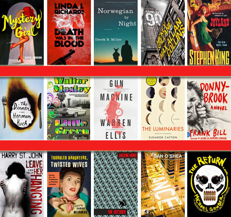
The nominees were works by: Frank Bill (Donnybrook), Mickey Spillane and Max Allan Collins (Complex 90), Harry St. John (Leave Her Hanging), Michael Gruber (The Return), Sarah Weinman (Troubled Daughters, Twisted Wives), David Gordon (Mystery Girl), Walter Mosley (Little Green), Eleanor Catton (The Luminaries), Arlene Hunt (The Outsider), Dan O’Shea (Penance), Linda L. Richards (Death Was in the Blood), Derek B. Miller (Norwegian by Night), Warren Ellis (Gun Machine), Herman Koch (The Dinner), and Stephen King (Joyland).
In previous years, I’ve recruited other crime-fiction authorities to help select the contenders and—together with Rap Sheet readers—weigh their artistic merits. For 2013, though, I took on the whole task myself, conscious of what I had learned over the course of six previous match-ups.
Looking back, it’s not too difficult to identify commonalities between the biggest vote-getters. Previous winners—such as Tom Rob Smith’s Child 44 in 2008 or Jedediah Berry’s The Manual of Detection in 2009—tend to boast original and prominent illustrations, though the art is sometimes rather complicated (as it was on the 2007 frontrunner, Michael Chabon’s The Yiddish Policemen’s Union). While photography seems to dominate book wrappers these days (Hard Case Crime’s handsomely painted covers being consistent exceptions to that rule), not once has a photo front scored first place in The Rap Sheet’s contest, though a few, such as the astonishing façade of Joe R. Lansdale’s Leather Maiden (2008), have earned spots among the runners-up. And all of the victorious jackets have made their typography—their titles and author bylines—integral components of the larger composition, whether it’s to help a small but important detail stand out more distinctly (as was accomplished with Penguin’s 2011 edition of Tinker, Tailor, Soldier, Spy, by John le Carré) or act understatedly in a way that allows a bolder central image to really “pop” (as was done on the 2010 English translation of Japanese author Shūichi Yoshida’s Villain.)
There’s no science to creating this sort of survey; judges bring their individual likes and dislikes to the process, as do readers who cast their votes. I don’t see all of the book jackets released every year, and neither do most other people, so it’s worth asking, What might I have missed? And will I later kick myself for having eliminated one of the early contestants from the herd? Fortunately, I rarely regret nixing a cover, though I have occasionally discovered a would-be wonder slightly too late for it to make the cut (as happened this year with Dublin author Keith Ridgway’s Hawthorn & Child).
Somewhat more often, I’m surprised—as I was this year, when a dark horse crept up steadily through the pack, scoring top honors by a nose. Which leaves me to recap The Rap Sheet’s 2013 Best Crime Fiction Covers champs (hint, they're all in the top row above):
1. Death Was in the Blood by Linda L. Richards
2. Mystery Girl by David Gordon
3. Norwegian by Night by Derek B. Miller
4. Complex 90 by Mickey Spillane and Max Allan Collins
5. Joyland by Stephen King
If you would like to see how the votes broke between these 5 books and the other 10 covers in the running this year, follow this link and scroll down to the poll at the end. Also check out my comments on the 2013 cover contest.
Much has changed about the covers of crime, mystery, and thriller novels over the last half century. There was a time when provocatively attired (or less-dressed) women, heavily armed thugs, or voyeuristic imagery could sell paperbacks in profusion. Nowadays, as Peter Mendelsund, an associate art director with publisher Alfred A. Knopf once told me, it’s not enough for covers to simply be different; they have to look “wicked cool and awesome.” I’d say that all of The Rap Sheet’s big vote-getters for 2013 satisfied that criterion. They also put pressure on me, and anybody else I enlist to aid in judging next year’s challenge, to come up with a no-less-alluring shortlist of rivals. It’s a good thing I have already spotted a couple of potential 2014 candidates.
This Sweepstakes has ended.
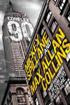
To enter for a chance to win one of three hardcover copies of Complex 90 by Mickey Spillane and Max Allan Collins (with all the pages, and not just the fancy cover included), make sure you're a registered member of the site and simply leave a comment below.
TIP: Since only comments from registered users will be tabulated, if your user name appears in red above your comment—STOP—go log in, then try commenting again. If your user name appears in black above your comment, You’re In!
Complex 90 Comment Sweepstakes: NO PURCHASE NECESSARY TO ENTER OR WIN. A purchase does not improve your chances of winning. Sweepstakes open to legal residents of 50 United States, D.C., and Canada (excluding Quebec), who are 18 years or older as of the date of entry. To enter, complete the “Post a Comment” entry at https://www.criminalelement.com/blogs/2014/02/the-rap-sheet-2013-crime-novel-cover-contest-please-judge-these-books-finalists-j-kingston-pierce beginning at 10:00 a.m. Eastern Time (ET) February 28, 2014. Sweepstakes ends 9:59 a.m. ET March 7, 2014. Void outside the United States and Canada and where prohibited by law. Please see full details and official rules here. Sponsor: Macmillan, 175 Fifth Ave., New York, NY 10010.
J. Kingston Pierce lives in Seattle. He’s the editor of The Rap Sheet, the senior editor of January Magazine, and the lead crime-fiction blogger for Kirkus Reviews. In addition, he has penned more than half a dozen non-fiction books, including San Francisco: Yesterday & Today (2009), Eccentric Seattle (2003), and America’s Historic Trails with Tom Bodett (1997).
Covers can make or break a title. Great selection!!
Count me in.
Interesting covers
I was one of the fortunate voters for the covers. Would love to win a set of three!
I tend to like calm covers, like the one for Norwegian by Night. I find that gaudy, in-your-face covers trigger a response somewhat like nails on a chalkboard.
I like the variety in the covers.
You may not be able to judge a book by its cover, but the covers can affect interest and sales in a book nevertheless. Guess the old saying writers weren’t much for marketing….
I am glad I voted before I read any of them. Having read Norwegian by Night, I now like that cover better than before reading that wonderful novel. I am no longer objective.
It wasn’t my favorite cover, but I have the feeling the book might be better than the cover.
Looks like a good book.
I think the font plays a big role in design, and it’s one of the things that edged up that Linda Richards book. The font is gorgeous.
I must admit I judge books by their covers. Complex 90 has an awesome cover; would love to see what’s inside! Thanks for the chance to win.
Looks awesome
I love collecting old covers
Love your site. Thank you!
Sounds great
i like the cover of the book titled little green.
Sweet! I always judge books by their covers, but I still read ones whose covers I don’t like hehe I’d love to give this a read
looks good
The cover is interesting and I like the authors.
love the cover!
Enjoyed reading your backstory. Thanks for the giveaway.
thanks for the chance
A good cover design can certainly influence one to consider a book and look further if one is not familiar with the author. But if I enjoy reading a particular author, I will choose the book regardless of the cover.
I like exciting colors on a book cover. Lots of Red!
Cover Me! Yes!
I like the cover. It conveys tension. I would love to win.
The cover is nice, but the important thing is Collins carrying on the Spillane tradition.
I am not influenced by covers to lure me in to read a book. I am more impressed by the main story and on occasion the author writing the book. But my personal favorite of the covers listed would be the one on Joyland by Stephen King. That has the look of the image of one of those crime novels covers of private detective stories where they show the heroine in emminent danger.
Interesting – would like to see the book along with the cover!
GREAT LOOKING COVERS.
MY TURN TO WIN??
I do feel the cover has a lot to do with why I buy the book. I am really looking for something that grabs me.
I think the books look great
Awesome!
Covers can make a book more appealing.
These booksare just what my husband needs this long winter, he loves them all
Count me in, please!
Sounds like a good read for summer!
Thanks for the chance to win
Great article! Four of the top five ranked among my selections. Thanks for the opportunity!
The cover is interesting
Groovy Rap Sheet!
Great stuff. Thanks.
[u][b]I Like em all![/b][/u]
A cover may get you to pick a book up but the first chapter sets the hook to get you to read to the end.
Oh man the cover of this book looks amazing!
I want to read it and I don’t even know what it’s about yet!
I sometimes do check out a book just by its cover, I love some of the covers out there they are beautiful pieces of art
These three covers are all superb. I’ve read the Max Allan Collins one and the book is as good as the cover.
Great cover! But all of them are good…
It may not be the best book on the shelf, but a great cover gives it a first look by the reader.
It’s not my favorite cover of the bunch, but it’s a darn good one anyway. Would love to win a copy.
cover is OK, I have found that judging a book by its cover is usually fairly accurate, however the same does not hold true for the euphemism in regards to life!
I would be attracted to Dan O’Shea and Linda L. Richards books, based on the covers alone. I’ve always been drawn to books by the covers not really understanding what exactly it is that catches my attention. Sometimes I think it is a familiarity related to the thousands of books I’ve read over the years. Who knows? All the covers are nice but many I would pass on because the covers indicate stories and genres I am not exactly fond of. There are 5-6 I would definitely skip because of the covers. The rest would probably entice me to at least pick up the book to read the synopsis.
please include me – looks great.
liked looking at all the covers. would love to read the books.
I wanna win!
Such great covers. I particularly like DONNYBROOK and MYSTERY GIRL, but they are all great selections.
Cover art usually mystifies me. I do not understand the attraction of a lot of the current crop of covers. For me, wicked awesome more often turns out to be totally ignorable. As an aging baby boomer, the 50s and 60s covers have the most attraction. For instance, I still have a small collection of Carter Brown paperbacks, which I loved for their sexy covers. The stories were pretty forgettable, but the covers made them worth keeping. (I read one a few years ago and found it to be pretty funny in a campy sort of way.) If I were at a newstand today that had the 15 covers above displayed, I would undoubtedly pick up and look at Mystery Girl, Twisted Wives, the Max Allan Collins title, and Joyland. Then I would immediately put Joyland back after admiring the cover. (After The Colorado Kid, I have sworn off Stephen King permanently.) The rest of the covers wouldn’t even register with me.
I like an attention grabbing cover.
i love this
Love the Spillane/Collins cover – retro for Spillane and high tech signage for Collins
Cover art is fascinating! It has become a specialized genre all its own, and it goes through timely trends as some cover designs begin to resemble the style of existing or currently trendy cover designs. I’m always interested in what the designers will come up with next. That’s the downside to eReaders.
I still like Joyland best!
sounds good
I really want a copy of this book
I like MYSTERY GIRL and THE LUMINARIES.
I really enjoy the covers that are throw backs to the fifties.
I would love to win this book. Mickey Spillane was one of the first mystery authors I read. A good cover will always make me pick up that book first.
Fantastic!
Generally I won’t buy a book with a cover I don’t like. It could be the most interesting book in the world, but if the cover sucks I won’t buy it.
Include me in. That one has a great cover.
Very nice!
My choice would have been “Joyland”. I liked the throwback theme and wondered what in the world the story was about, because it was Stephen King. Thanks for the contest and the opportunity to win Complex 90.
thanks count me in
Book covers are the reason why I don’t have a Kindle or e-reader…nothing like looking at a bunch of book covers on your bookshelf!
I can’t see the covers on my bookshelf – just the spines! Since I love graphics I like ‘good’ covers (on ebooks, too) and want them to fit the book the way this one for Complex 90 does.
covers make you want to read the story
Great Giveaway! Thanks so much for the chance 🙂
Nice covers but who picked those colors on the Walter Mosely book?!?
Hmmm, registered but don’t seem able to log-in. Oh, well.
Here’s my entry….
I’m not sure what to write as I don’t understand this sweepstakes…
cool
sounds like a fun one!
i’d love to read these behind bars!
i love to read, thanks for the chance to win!
sounds great
I always look at the jackets of books, they are so interesting and are part of the story!
The jacket covers are great. I have been a fan of jacket covers for a long time. A great jacket cover adds a lot to a great book.
I would love this!!
I would love to win anything by Max Allan Collins.
I am entering your giveaway.
It would be great to win a Hardcover copy of
Complex 90 by Mickey Spillane and Max Allan Collins.
This looks like an interesting book.
Thank you for having this giveaway!!!!!!!!!
Hi great covers although I thought the stephen king hard case crime was the best
I would love to win!
[b]Mickey Spillane & Max Allan Collins for Complex 90 cover, it has visual angles and has a noir feeling about it. Thanks for the chance to win![/b]
I like the cover Joyland
All the covers look great. Thanks for the chance to win.
Comment! Comment!
Good deal, count me in!
I’ll trade you a deck of Lucky’s and my Zippo for the book….
Would love to win such a elegant book.
Love the elegant old style of this,
Covers are the first thing you look at when you grab a book….it’s the initial attention getter.
Cover selected is okay but not my personal choice.
looking forward to reading this