 Can you imagine Don Draper, from AMC’s Mad Men, as a cold-blooded killer?
No? Well, I can’t either, but Jon Hamm’s character and that of Darwyn Cooke’s Parker could come from the same family. When their respective stories open, they are, essentially, a blank slate. Nothing is known of their past, and the only conclusions you can draw about their character is what they do. Draper sells advertising. Parker hunts the man who double-crossed him and left him for dead.
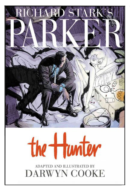
Darwyn Cooke’s The Hunter (2009) is an adaptation of the late Richard Stark's (nee Donald Westlake) book of the same name. Rather than taking the source material and modernizing it, Cooke wisely left Parker where the world first saw him back in 1962. At its core, The Hunter is a revenge tale, a fact that the reader doesn’t learn until nearly fifty pages into the graphic novel. Up until then, Parker is pure action. In a fantastic opening sequence, Cooke doesn’t tell a thing. He only shows what Parker does.
We see Parker how Westlake originally envisioned him, walking on a bridge. His shoes have holes in the soles, indicating he’s had them awhile or that he has traveled a long distance. He’s probably down to his last cigarette. He’s almost broke, since he hops the turnstile in the subway station. He takes the proffered cigarette from the diner waitress, yanks off the filter, and leaves. At the department of motor vehicles, he gets himself a new license, which, in 1962's New York City, doesn’t include a photo. He ages it in a public restroom, and gives his face a douse of water.
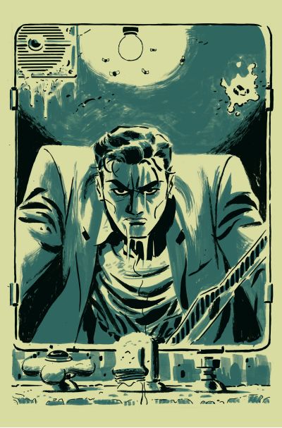
 Then, and only then, do we get the full-page splash of Parker’s face: angry, determined, dripping with water (or is that sweat?). Up until this point, his face has either been in shadow or not visible at all in the frames at all. You have to play detective as you’re reading through these first dozen and a half pages. Pretty much all you need to know about Parker is in these pages. I re-read the opening after I finished the book and, yes, it’s all there.
But Cooke doesn’t just show Parker. He shows Parker’s reflection in the grimy mirror, complete with an AC vent leaking, spittle on the glass, and flies orbiting the light bulb behind Parker’s head. It’s the first time where you have to question all that you know about the man, which, to that point, isn’t much. Is this the true man, or is this merely an imitation? Or an invention?
I haven’t read the original book, so I can’t say how closely Cooke brought Stark’s prose and dialogue from the source into this new medium. The dialogue, even the extended prose sections, are pretty terse, so I’m guessing this is a faithful adaptation. Besides, who in their right mind would change words Westlake/Stark originally created?
Where this version shines—even better than the three films produced from the book—is in the visuals. As fantastic as a written story can be, if it’s a comic book, it’s nothing without art. Think of Chris Claremont’s X-men without John Byrne, Neil Gaiman Sandman without Dave McKean, or Grant Morrison’s Batman and Robin without Frank Quitely. You just can’t, and, moreover, you shouldn’t. It isn’t a stretch to say that Cooke’s Hunter is comic noir, but with a twist.
Film noir gets a lot of print when discussing the history of crime and mystery fiction. The stark shadows and bright contrasts of these movies are often at odds with the subtle grays in which the characters live. Many great examples exist, but they almost all have one thing in common: they were filmed in black and white. I don’t think I’m alone in saying that film noir only belongs in black and white. I cannot imagine Robert Siodmak’s The Killers (1946) or Orson Welles’s Touch of Evil (1958) in color. When it came time for Cooke to draw the scenes for The Hunter, I suspect he had a dilemma: Do I paint in black and white or in colors? The black-and-white-in-comics thing does work, just look at Frank Miller’s Sin City and its sequels. That’s a dark story. The Hunter is, too, but Parker’s story has a little something extra.
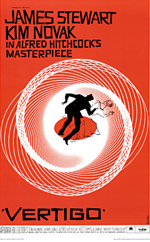
 By keeping the story set in 1962, and with Mad Men on television screens, I suspect Cooke made his choice to use only three colors—white, black, and teal—specifically to suggest an earlier time, not only how it was but how the era has come to be remembered in popular culture. This is the year before John Kennedy was murdered. This is the era of Camelot, Mickey Mantle, and now, the fictional Don Draper. By using teal, a color with shades of gray but still with the hipness of the Rat Pack, Cooke colors his story with starkness as well as nostalgia. The closest comparison his art has for me is that of a Saul Bass movie poster or title sequence. If you don’t know the name of Saul Bass, you probably already know his work, such as the movie posters for Vertigo (1958), Anatomy of a Murder (1959), or the opening title sequence to Alfred Hitchcock’s North by Northwest (1959). Its modern equivalent is the title sequence for “Mad Men.” In some ways, Cooke's color choice is almost like an ad Sterling Cooper Draper Pryce would pitch to Pan Am.
The overall effect of Cooke’s art is nostalgia tinged with a dark underbelly. Parker is not a likeable character, despite his repeated escapes. He’s not a man other men want to be, nor a man who drives women wild. He’s a cold-blooded killer who wants what’s his, and a little extra, just to be ornery. The beauty of Cooke’s presentation is that he’s keenly aware that the medium is a comic book. Thus, he plays with the conventions of comics to good effect. When he presents Parker’s history via flashback, he pixelates the images, providing the movie-looking equivalent of a Barbara Walter's special soft-focus lens. In more than one frame, Cooke draws his figures with elongated shadows that would make Siodmak proud. Parker usually scowls. Come to think of it, I can’t remember a frame where he even cracks a smile.
But we don’t read this kind of book because the anti-hero smiles. We read it because he kicks some serious butt along the way. His main mission—recover the $45,000 dollars he’s owed after a betrayal years before—is something we can all get behind. We want what’s ours, right? Sure, but would you kill for it? More to the point, would you know how to kill to get it back? Again, with no backstory, we have to take Parker at face value. The kinds of jobs he describes himself doing—mainly, theft—don’t usually involve killing. However, he’s not shy about the deed. I’m not sure how many people he snuffed in this book, but it numbers in the double digits. Then, just to give you pause, he lets other characters simply walk away.
Parker is a study in contradictions. Cooke knows that and presents the story not quite as a comic noir, but not as a full-color, traditional comic either. He leaves it up to the reader to decide. The question of season four of Mad Men was “Who is Don Draper?” Throughout the season, we were given a few possible answers. In Darwyn Cooke’s The Hunter, we are given less to consider with Parker. Who is Parker? No one truly knows. I’m not sure he knows, either.
Visit our Comics & Graphic Novels feature area for more.
Scott D. Parker, who knows himself perfectly well, is a professional writer who discusses books, music, and history on his own blog, and is a regular columnist for Do Some Damage.

Stark’s Parker has long been one of the great characters in crime fiction. This update looks faithful and I will snag a copy asap.
Thanks for the informative review, Scott.
This looks terrific. Fun to see Parker in person.
Oh, this looks fantastic! I know I have some Westlake on my shelves, and I love the blank slate protagonist. Thank you!
Great article on an amazing adaptation.
Cooke’s follow-up Parker adaptation, The Outfit, came out late last year and I’ve heard great things about that one as well…
Had to start your first post by plastering your name everwhere, eh, Parker? Good to see you over here.
I’ve been a fan of Cooke’s since he jumped from animation to comics for DC. Getting these beautiful graphic novels was a no brainer. I love how they jump from long segments of stylish story telling art, lush and invoking a time when the books first came to light, sparse and then jumping to dense (for sequential art) blocks of text without overwhelming the reader.
The second book, THE OUTFIT is just as evocative. I actually like the cover art of the second book more, more stylish and abstract.
I hope that more are to come. I’d love to have a library of Darwyn Cooke adapted Parker graphic novels.
Look forward to your next write up Scott.
Thnaks for Shaering it
Thnaks for Shaering it