
Often, the most tumultuous part of the publishing process is the creation of cover art. Responsible for hundreds of books a year, artists work tirelessly to create the perfect image to represent 300+ pages, and publishers, editors, sales reps, and marketers all weigh in with opinions that the artist has to absorb and consider. Tough!
But sometimes the process runs smoothly and produces perfection. Executive Art Director David Rotstein has worked on 10 covers for Charles Finch's Victorian era series, and each of them captures the suspense, character, and history in the books impeccably.
Authors don't often get the chance to communicate directly with the artists, but to commemorate the 10th book in the Charles Lenox series, Charlie and David were able to get together to discuss what happens behind the scenes in this exclusive Q&A.
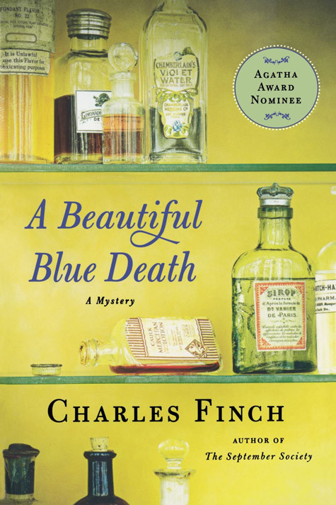
Charles Finch: I love the covers of the Lenox books so much, especially their unity over what’s turned into a long series—every Lenox book has three old-fashioned objects on the cover, with one of them just slightly askew (a shattered pair of glasses, a broken key) to hint at a crime. Do you remember coming up with this idea? How has it evolved?
David Rotstein: Our publisher wanted to redesign A Beautiful Blue Death for paperback. The goal was to have more menace than my original hardcover design. In rethinking the project, I knew that one of the things that was so special about the book was how well it put the reader into the time-period in a very realistic and appealing way (and this was long before the Downton Abbey phenomenon).
One morning, while getting ready for work and pondering what to do for the cover, I opened the medicine cabinet to get the toothpaste and looked at the rows of shelves. I thought how, back in the day, all of these labels and everyday objects would have been so beautiful … and I had my cover idea. I hired photographer Jon Shireman to create the artwork. Here, you can see Jon’s preliminary prop research that he did for me. We knew that we had something special, and I designed The September Society to match.

CF: Do you take inspiration from the title of the books? The period? Have you read any of them? (I won’t be even slightly offended if you say no!)
DR: I’ve only read very small portions of the books. Typically, when I need to begin work, a brief or sample chapter are the only things available. Inspiration is definitely drawn from the time period. Title is very inspiring in coming up with imagery. My favorites in that regard are probably The September Society and Home by Nightfall.
CF: Aside from the recurring trios, I love the color palette of the covers—usually just a single soft-focus color. Have you noticed how often this has been repeated in the industry following the success of the Lenox books (cough, cough)? There are some eerily similar ones out there.
DR: I love the colors and treatment of the covers for this series. When I do see similar book covers out there, I usually chalk it up to coincidence.
CF: Does it bug you to have all that text (quotes, blurbs, plot summaries) messing up your beautiful images? I think it would bug me.
DR: Normally, yes—I do prefer having less copy, which can visually clutter a cover. But for these books, I actually prefer having the extra copy. It feels very old-fashioned (in a good way). Look at A Beautiful Blue Death—those labels were loaded with text. Victorians loved intricacy and complexity.
CF: What’s a cover, recent or vintage, that you find unusually beautiful or striking?
DR: There is so much out there that it’s so difficult to pick. But Oliver Munday’s cover for Carrie Brown’s The Stargazer’s Sister is exquisite. I am in awe of it ever since first seeing it. My favorite vintage book cover—that would have to be The Great Gatsby.
CF: What about a classic cover that you can’t stand the sight of? (Mine is The Great Gatsby.)
DR: What! Oh, I was only joking about liking that cover before—yes, that’s a horrible cover. In seriousness though, for me, any old cover automatically looks amazing. Clunky heavy type from the 70s, cheesy type from the 80s—it all becomes awesome the more it ages.
CF: Finally, people often tell me how beautiful the covers of my books are. It’s fine if I just take credit for that, right?
DR: Absolutely. I may be selecting an outfit for you to wear, but you’re the frontman.

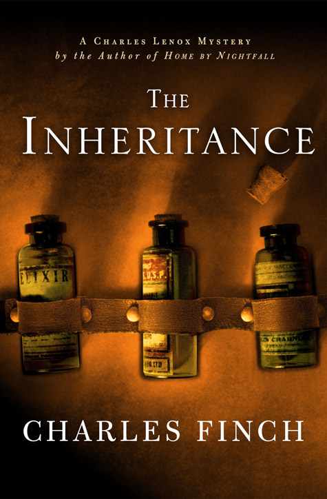
To learn order a copy of The Inheritance, visit:
opens in a new window![]() opens in a new window
opens in a new window![]()
Charles Finch is a graduate of Yale and Oxford. He is the author of the Charles Lenox mysteries. His first novel, A Beautiful Blue Death, was nominated for an Agatha Award and was named one of Library Journal's Best Books of 2007, one of only five mystery novels on the list. His first contemporary novel, The Last Enchantments, was published in 2015. He lives in Chicago.