 Die a Stranger is Steve Hamilton’s newest Alex McKnight novel, and it’s thrilling. The book opens with a plane secretly landing on a remote, abandoned air strip in Michigan’s Upper Peninsula, and a drug trafficking deal gone wrong.
Below is my very first design for the cover. Until writing this, I had not realized how circular the journey of this cover was.
People liked this cover, but it seemed too minimal, too vague. It looked more like aliens than an airstrip. I tried some more conventional runways at night, but without the fog they were lifeless.
We thought to try something with the plane. Some of these are more finished. Others are only for concept. The aerial photo in the background at top left is from Christo Crous. He has an amazing, collection of stunning, other-worldly aerial photos. I also like the bottom right cover, which used a photograph from Travis S.
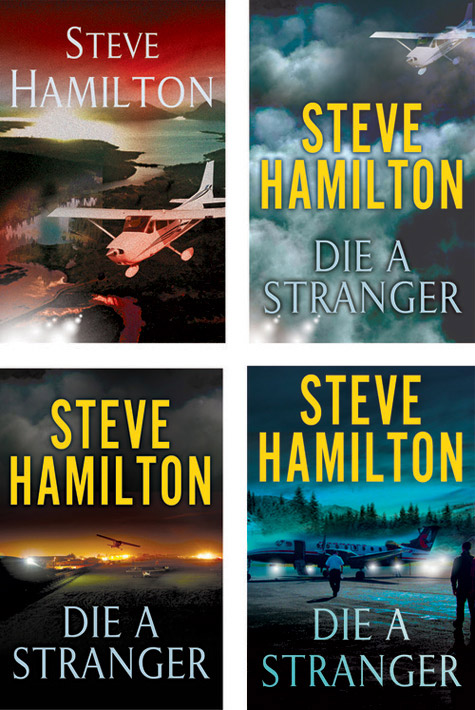
But now I had swung too far the other way. I was telling too much story. Plus the plane somehow seemed to be too narrow and specific, too hard for an “everyman” to relate to.
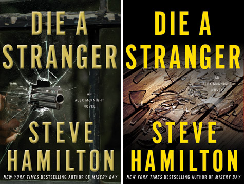
The previous McKnight novel, Misery Bay, had an image of a gun frozen in ice. We thought to try closely echoing that cover. Or perhaps show broken glass scattered on a cabin floor. The two versions below were created with images from Jon Shireman. I love the art on its own, but on the cover they somehow seemed too forced.
All of us were out of ideas. I find that at this stage of a project I need to start over—force myself to forget everything that’s come before, everything that’s been said prior, and approach the project as if tackling it for the first time.
The result was the design below.

I liked it a great deal, but not well enough for me to share with anyone else (until now). It wasn’t dangerous or moody enough. More importantly, it felt too ordinary. Too much was being spelled out with the photo-realistic treatment.
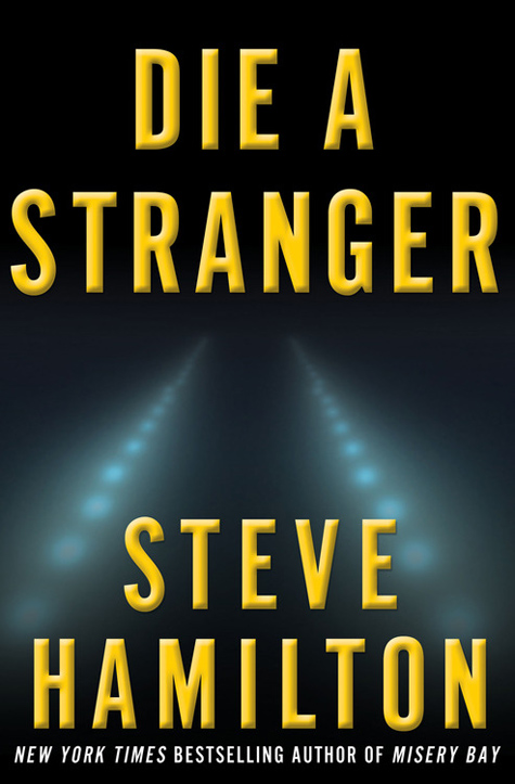
It needed to be stripped down and reduced, to have all of the extraneous information removed. And so it was, that within just a few hours of grappling with revisions, our final cover was born.
David Rotstein is the Art Director of Minotaur Books. He hopes you have as much fun viewing these entries as he has creating the covers.
If art is your thing, be sure to check out Minotaur’s Cover Art Tumblr to see how all the fantastic covers are born.
I love this “behind the scenes” look at the cover possibilites and the process of coming up with a good one. Great cover for a fantastic book.
I must admit that if an author is one of my autoreads, I really don’t pay much attentiom to the cover. The cover really hit me as I was reading the book and understood the significance.
Thanks for the behind the scenes look.