You may notice the overriding theme of crime in the shows I like. Even Once Upon a Time, which isn’t a crime show, features plenty of nefarious doings.
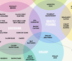
The geek in me also loves graphs, charts, and even *gasp* statistics. Yeah, I know. Hide your eyes. But that’s why I found this series of Eleven Charts and Graphs About Television from our pals over at MentalFloss so fascinating. Being into the visual, I particularly like all the Venn diagrams, especially the one about the intersecting worlds of reality television. I don’t watch any “Reality TV,” but it astonished me how many similar shows existed. (I guess wedding-related Reality TV is like serial killer fiction…a genre unto itself.)
I think my favorite Venn diagram categories, however, are in the Esquire chart. “People Saving People Meanly” describes so many shows I see advertised, as do “People Being Crummy” and “Degradation.” It does give one pause.
The scariest graph there is “What Makes a Really Good Mother on Reality TV.” Yikes.
I know! Eeeeeeesh. I had no idea there were SO many shows–and this doesn’t even touch the competition ones like American Idol and stuff. *shakes head*